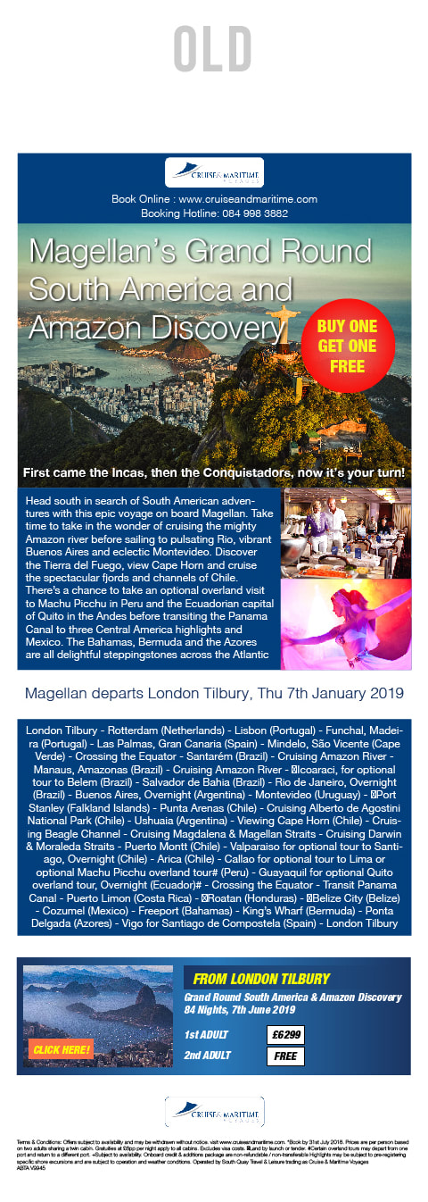
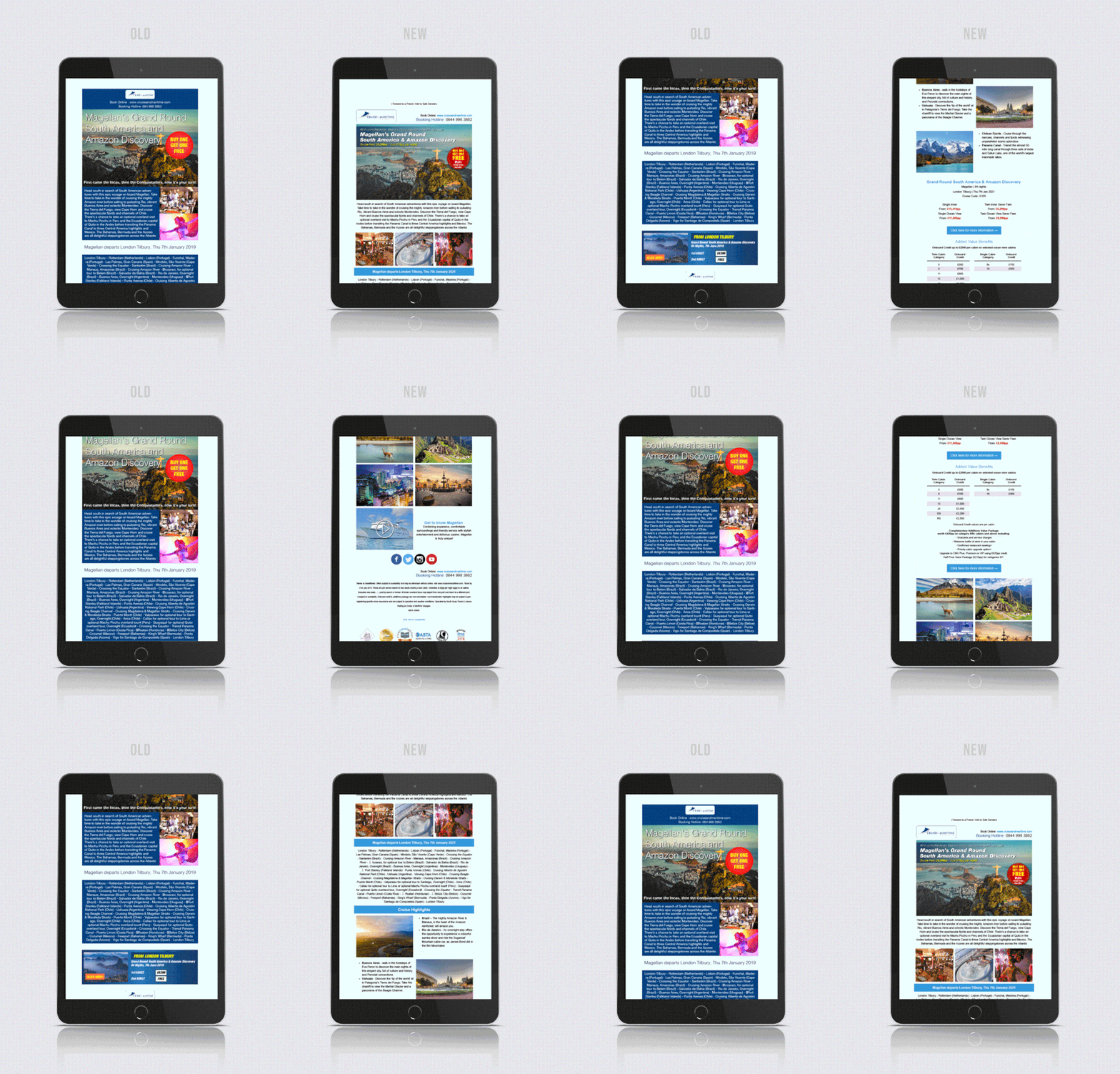
I created new designs for the Cruise & Maritime Voyages newsletters, refreshing their outdated style for a dynamic look. This was a collaborative effort with the web developer, creating a brand focused style that grabs the attention of the viewer and guides them through the email while maintaining their interest. I found that the old email design lacked variation of image and text, and that it was one giant image. The redesign splits elements of the previous version from image to text, such as the cruise overview and itinerary. I based my design around the company website, as that was the purpose of the email, to get the consumer to click through to the website which they would go on to purchase a cruise. I also decided to give more information about the cruise in body of the email, such as cruise highlights. Using powerful images and enticing descriptions it would generate more interest in the product being marketed. Not only does it look visually pleasing, the updated layout and image format has more impact on retina screens. The redesign was made to be responsive to the platform viewed upon, as most of the target audience views these emails on large screen devices such as tablets and font-enlarged desktops.
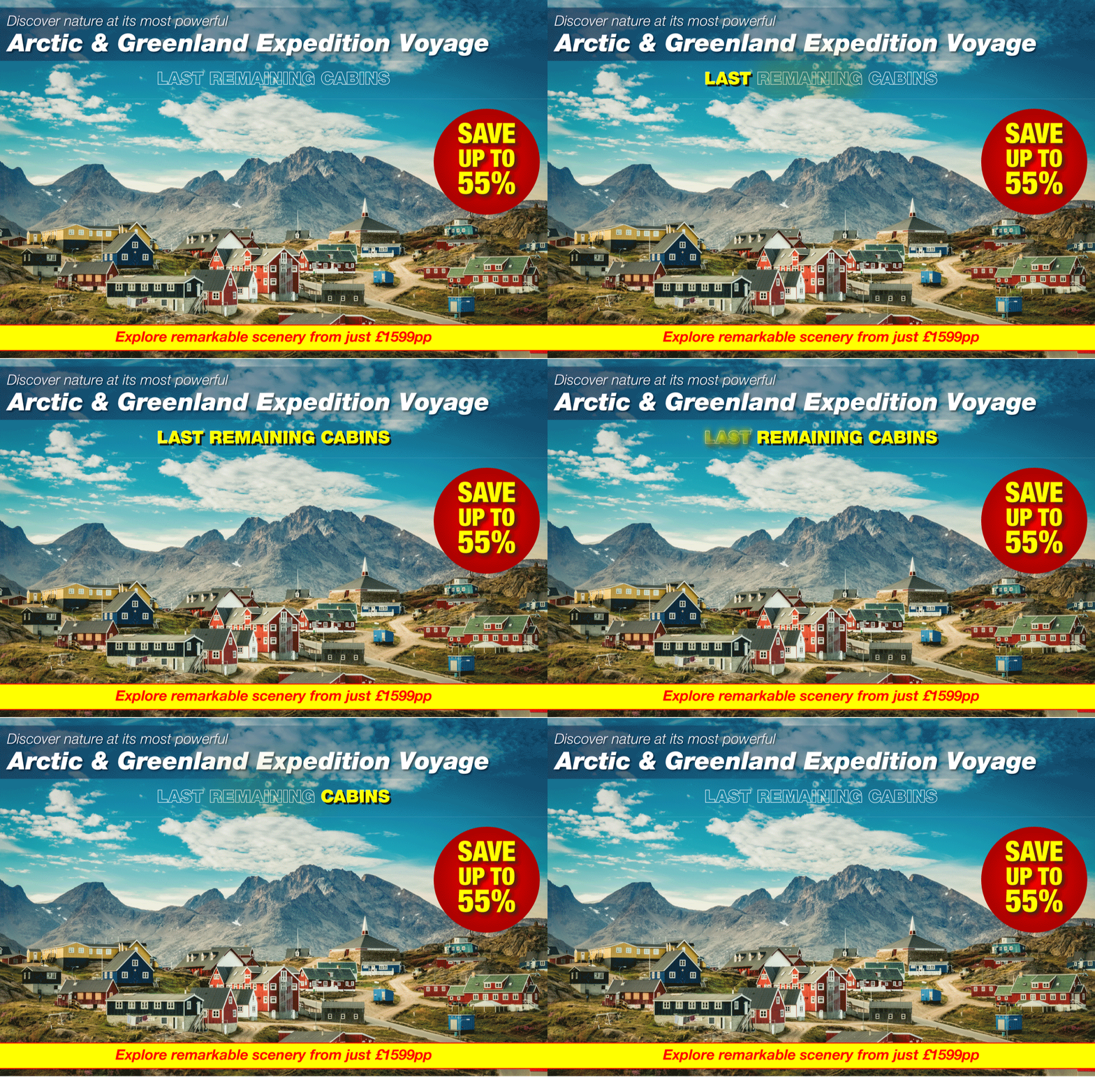
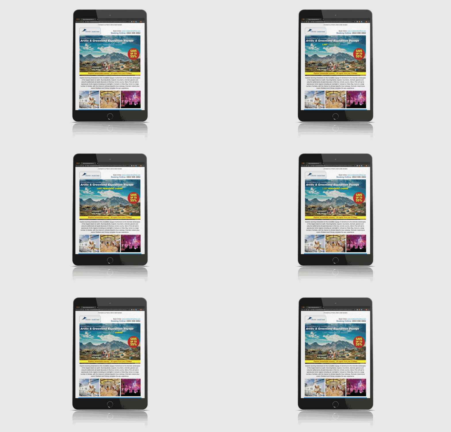
During the redesign I also produced various styles of animations for the header of the email. The use of animation would is to emphasise a selling point or one of the main focuses of the email. In this case, the email being sent out was to push the Arctic & Greenland Expedition Voyage cruise departing within 4 weeks of sending the email to our database. I designed the animation for the header originally as one big gif, however due to the size of the file the email would have been filtered to spam or not loaded correctly to customers with slow internet. Instead I split the main header in two and only animated the top half. When put together (the gif and png) it looks like one.


