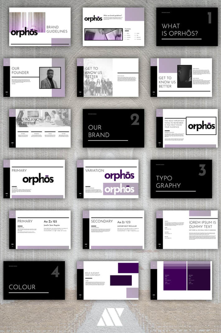
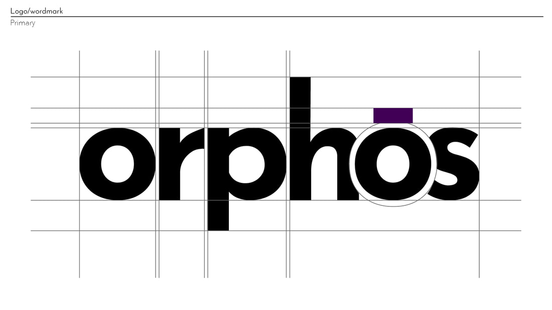
When I designed the logo, I wanted to capture the ethos the agency was based on. They aim to engage with their clients and create partnerships with organisations through engaging experiences. Building relationships with customers online and face-to-face when providing visual services. I wanted the brand's identity to be easily rememberable by their clients as they recall their experience with the agency.
The idea to keep the logo as a wordmark was to stand out from the over stylised logos of other competitors, keeping it simple but modern and clean with an added splash of colour; a darker shade of purple to avoid a feminine connotation. The brand guidelines allow for more flexibility, allowing the brand to stretch its creativity across its outlets while also remaining timeless and true to the original ethos.
The idea to keep the logo as a wordmark was to stand out from the over stylised logos of other competitors, keeping it simple but modern and clean with an added splash of colour; a darker shade of purple to avoid a feminine connotation. The brand guidelines allow for more flexibility, allowing the brand to stretch its creativity across its outlets while also remaining timeless and true to the original ethos.


